How to use Tableau in data science, parameters

A little bit about parameters in Tableau, easy dynamic viz
Published on September 21, 2023 by Jeffry Troll
data science Tableau interactive viz
7 min READ
This topic assumes that you know the very basics of tableau, here is a good tutorial for new users.
Parameters
In Tableau, a parameter is a dynamic value that can replace a constant in a calculation, filter, or reference line. For example, if you have a formula that returns a value of Sales > 5000, you can replace 5000 with a parameter. This allows you to input different values or choose from a predefined list or range, making the visualization or result set dynamic based on that parameter. Today we are going to learn how to take advantage of this dynamic power of parameters.
Connect to your data
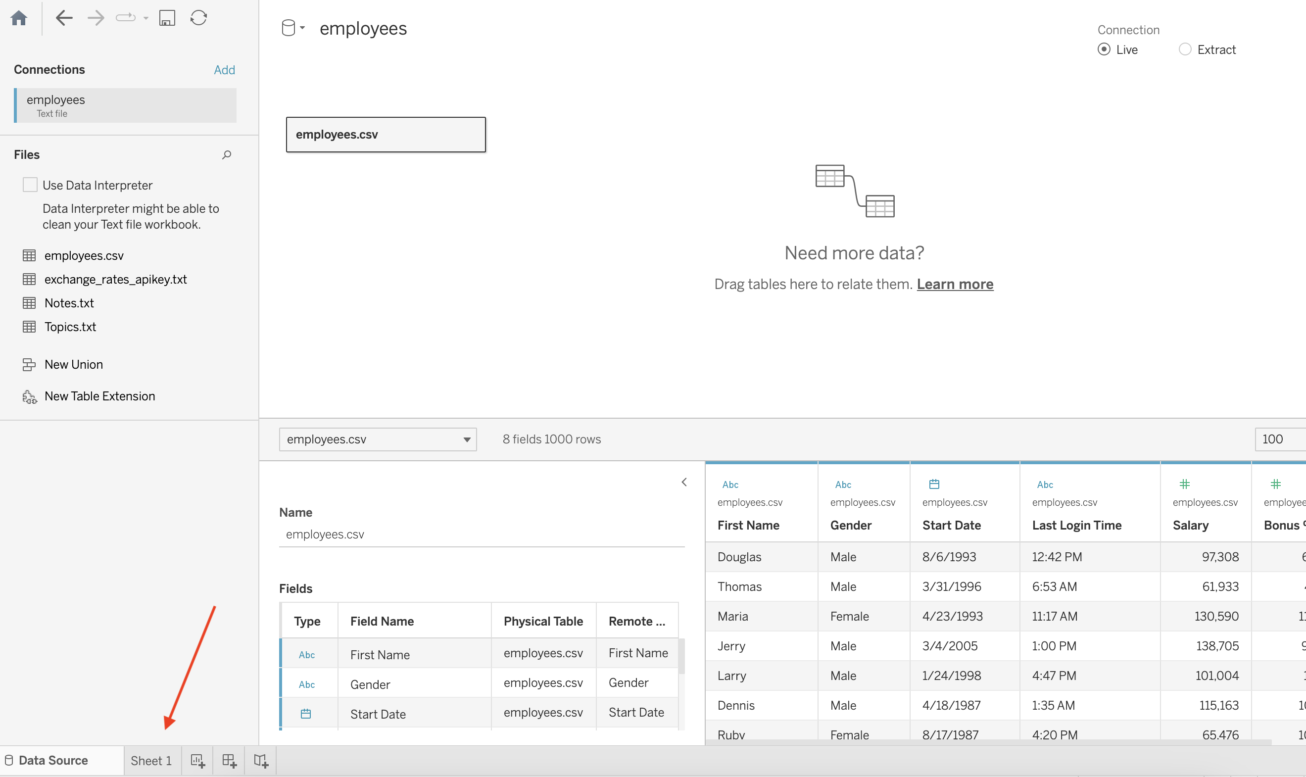
The first step is to connect to the data you want to explore. This example shows how to connect a CSV file data in Tableau Desktop.
- Open Tableau. On the start page, under Connect, click More. In the Open dialog box, navigate to the CSV file on your local computer. For this example, I’m using the Employee data from Kaggle
- After you connect to the CSV data, the Data Source page shows the sheets or tables in your data. Drag the “employees” table to the canvas to start exploring that data.
- Click the sheet tab to go to the new worksheet and begin your analysis.
Build the parameter
This step is to set the parameter.
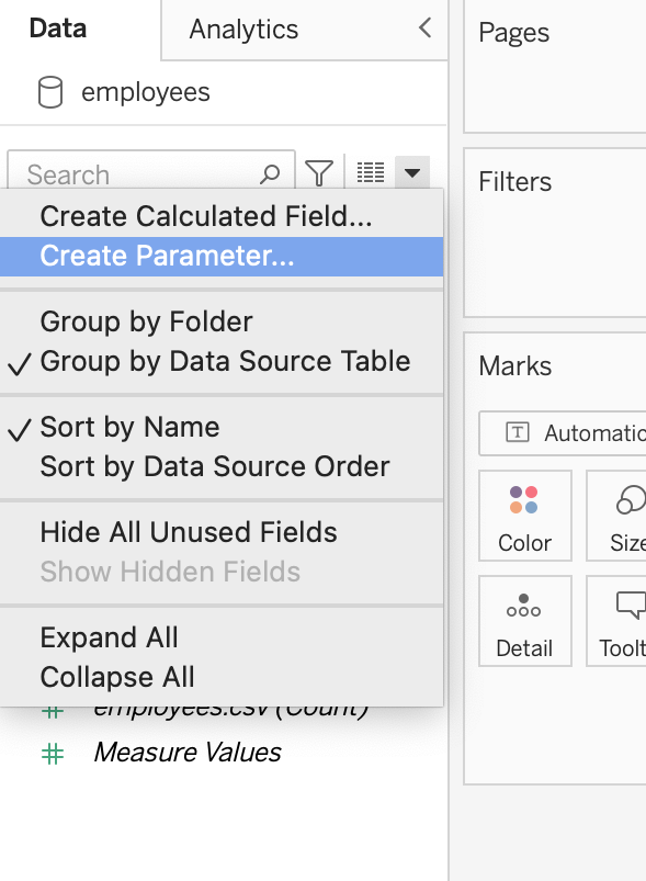
- In the Data pane, click on Create Parameter.
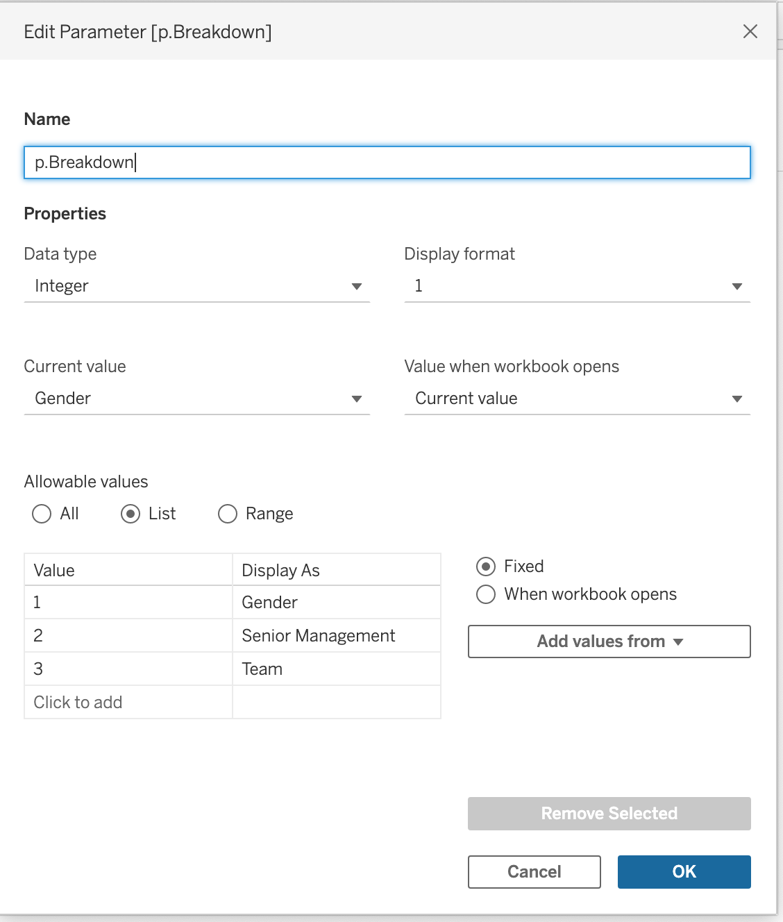
- Choose a name for the parameter, in this case “p.Breakdown”.
- Choose Integer as the Data Type.
- Choose List as Allowable Values.
- Add the categories of interest to the list.
- Click Ok.
Set the breakdown
This step is to set the categories.
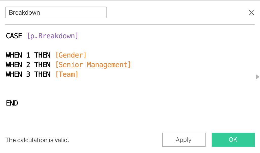
- In the Data pane, click on Create calculated field.

- Add a name for the new calculated field, in this case, just “Breakdown”
- Add a formula, in this case, the purpose is to assign the group, categories, or breakdown of interest.
- Click Ok.
Set the placeholders
This is to prepare the buttons and actions through placeholders. (Don’t worry if you don’t understand, it will make sense later)
- In the Data pane, click on Create calculated field.
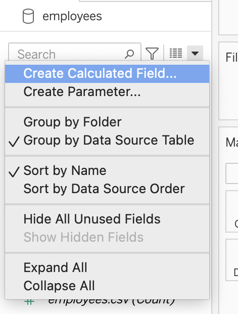
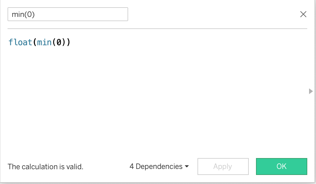
- Add a name for the new calculated field, in this case, “min(0)”.
- Add a formula, “float(min(0))”. In this case, the purpose is to assign a placeholder. (Later we will use them as a reference to set an action)
- Click Ok.
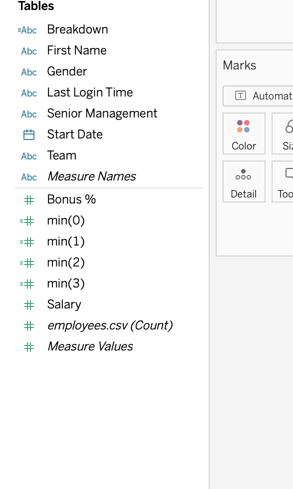
- Now we need to repeat this process, creating another min(value) for each category, in this case 3. The difference will be that instead of 0, change it to 1 and then 2, and so on. You should be good if you have min(0), min(1), min(2), and min(3).
Build the buttons
This step is to start our viz, in this case, the buttons.
- Add a new worksheet, called “Gender button”.
- In the Data pane, drag min(0) to “Details”, under Marks section.
- Drag min(1) to “Columns”.
- Drag “Breakdown to “Label”. Double-click, so you can edit inside “of the bubble”. Erase everything and write “Gender” or your first category on the parameter list.
- Click on Label. Here you can edit the format and alignment of the text, in this case, I selected centered.
Click over the X-axis, it should be got highlighted, now Right-click and uncheck the option “Show Header”. (You can do the same with the title)
- Now we need to repeat this process, so go ahead and re-do for each category. Change the names respectively and instead of using min(1), use min(2) and min(3).
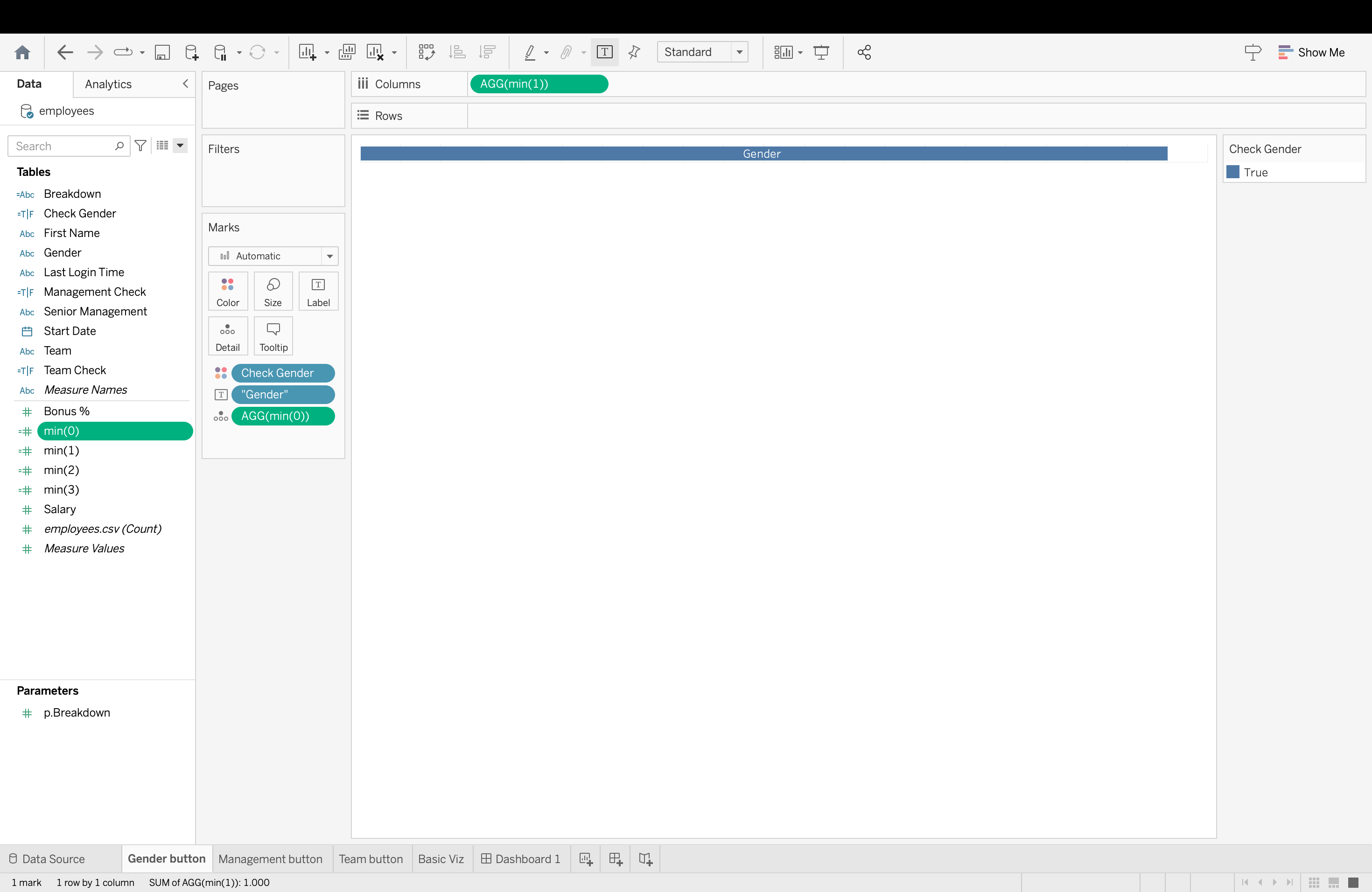
- Click on Create Calculated Field.
- Write “Check Gender” as Name.
- Write formula “[p.Breakdown]=1”.
- Drag “Check Gender” to Color, under Marks.

- Now we need to repeat this process, so go ahead and re-do for each category. Change the names respectively and instead of “[p.Breakdown]=1”, use 2 and 3.
- Note: Also you can change the color so it makes sense which Category are you selecting
Create a basis viz
This step is to create the main visualization.
- Add a new worksheet, called “Basic Viz”.
- In the Data pane, drag Salary to “Text”, under Marks section.
- Click on “Salary” and change the measure to AVG. By doing this we are getting the average Salary.
- Drag “Breakdown” to the rows section.
- Drag “Start Date” to the colummns section.
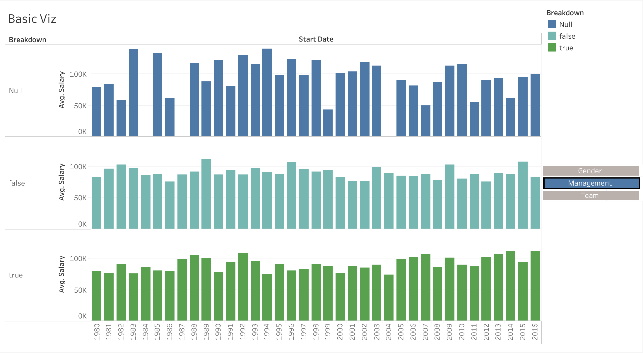
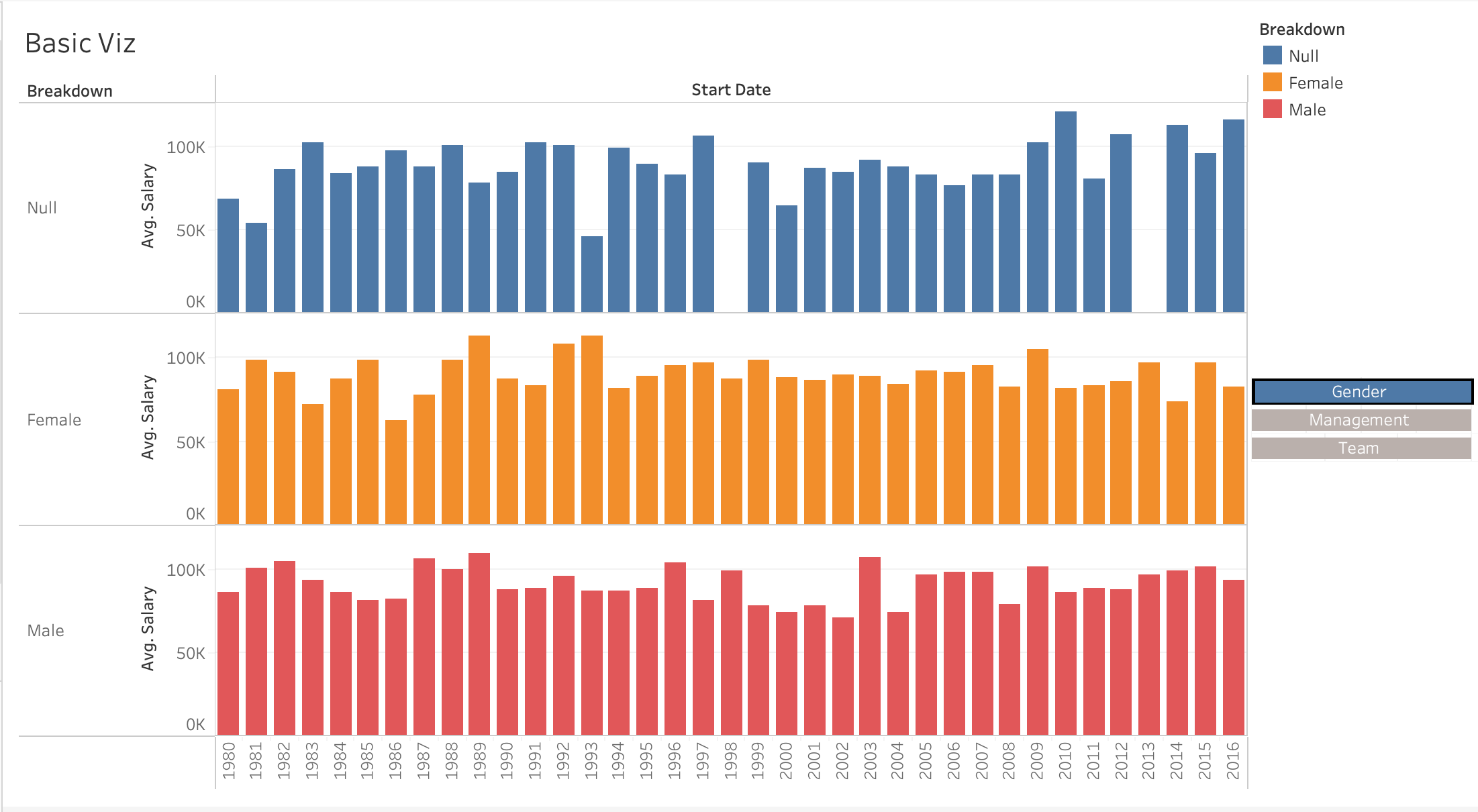
- By doing this we are getting the average Salary for each year, you change the viz in the right corner under “Show me”. Also you can another “Breakdown” to the color section.

Build the Dashboard
This step is to build the dashboard, connecting the buttons of categories to our main viz.
- Click on “New Dashboard”, the second icon at the bottom section.
- Double-click in “Main Viz” and it will automatically fit the dashboard.
- Click “Floating”, under the object section and drag the button worksheets to the dashboard.
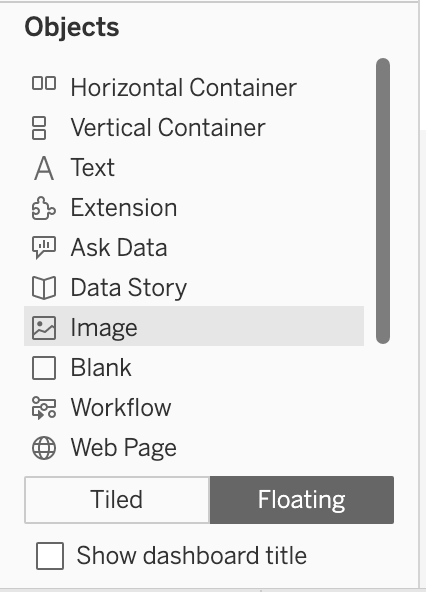
- Re-organize and change size according to your preference. It might be helpful to click under the “Layout”, so you can identify the coordinates of each floating object, in this case, each button worksheet.
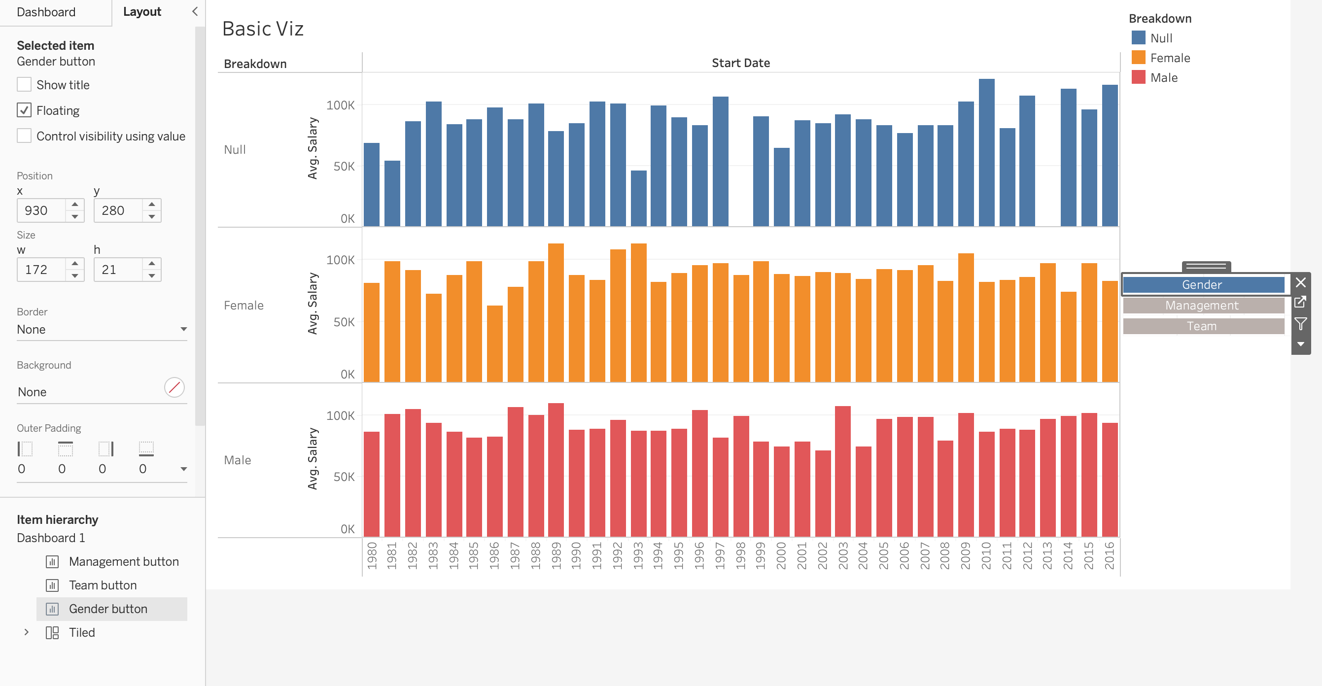
Set Actions
This step is to create the interactive function, through the actions, in this step, we will use our placeholders. The goal here is to click each category (the floating objects), so the main viz will change according to the selected category.
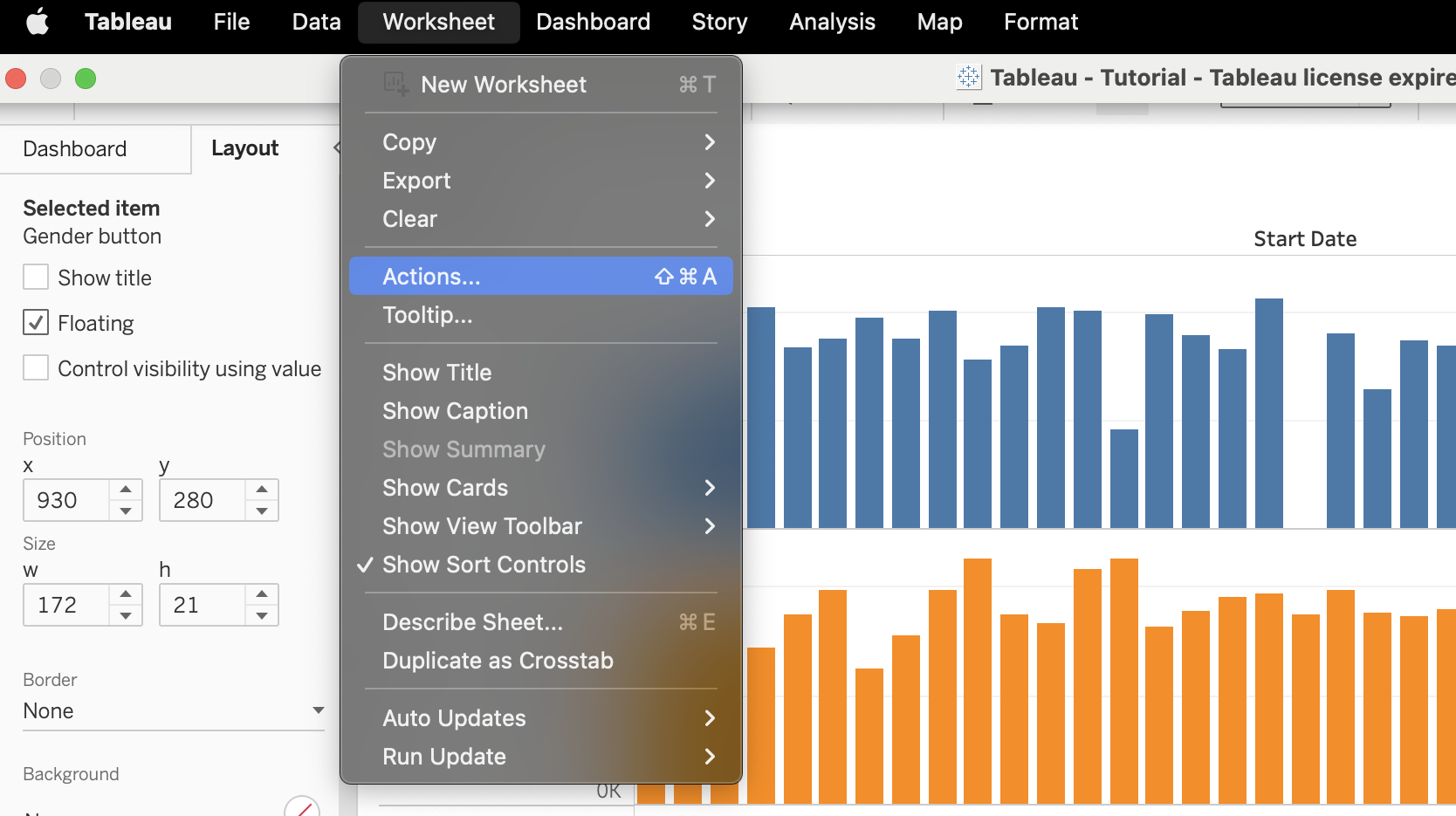
- Click Actions, under the Dashboard.
- Click on “Add Action”. Choose “Change Parameter”.
- Change name to “Gender button”.
- For Source Sheets, select the worksheet where is the Gender button, in this case “Gender button”.
- For Target Parameter, select p.Breakdown.
- For Source Field, choose min(1).
- For Aggregation, choose None.
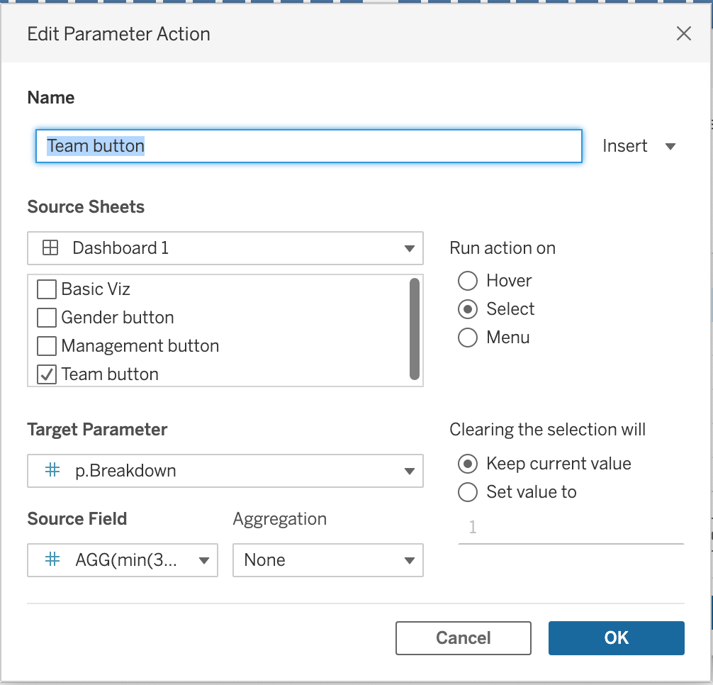
- Now we need to repeat the process for each button, so change accordingly and notice that for Source Sheets and Source Field, you should select the values that belong to each category. In this case, for “Gender” = min(1), for “Management” = min(2), for “Team” = min(3).
Conclusion
Tableau provides an immense array of powerful features for data visualization and interactive dashboarding. As we’ve seen, parameters stand as one of its unique assets, granting flexibility and dynamism to your visualizations. By enabling users to interact with the dashboard and control aspects of it, parameters enhance the storytelling potential of data, making insights more accessible and user-friendly. What we’ve walked through in this tutorial barely scratches the surface of what’s possible with Tableau. As you further delve into its capabilities, you’ll find that the true strength of Tableau lies in its ability to seamlessly blend data analysis with intuitive design, and parameters play a pivotal role in that. So, get creative, experiment, and remember: in the world of data visualization, your canvas is as dynamic and vibrant as you make it!